
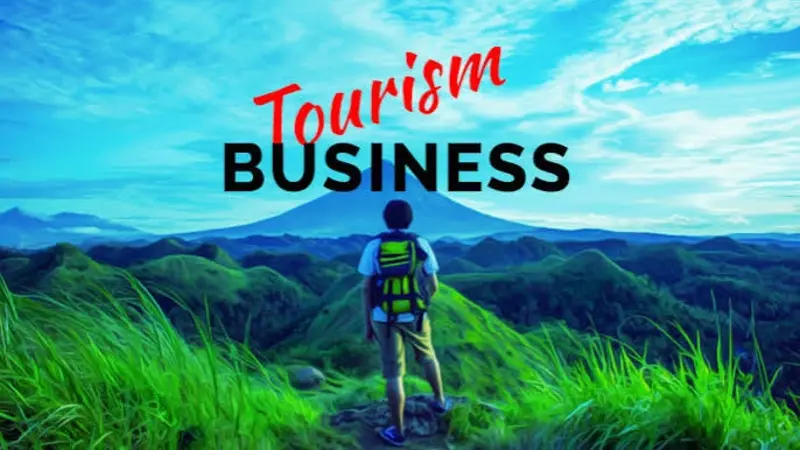
Travel decisions are highly visual. Before travelers compare prices or read every detail, they often notice the destination photos, colors, layout, and overall presentation of a tourism business. Strong visual design helps hotels, tour operators, attractions, and travel agencies communicate what an experience will feel like before a visitor arrives. By improving photography, banner design, typography, branding, and mobile presentation, tourism businesses can capture attention while also making trip planning easier and more trustworthy.
Why Does Visual Design Matter in Tourism Marketing?
Visual design is the planned use of images, colors, typography, layout, graphics, and other visual elements to communicate information. In tourism, its job goes beyond making a website or advertisement attractive. Good design helps potential travelers understand a destination and imagine themselves experiencing it.
Travel is difficult to evaluate before purchase. A traveler cannot test a hotel room, walk through a historic district, or experience a mountain tour before booking. Images and design help reduce this uncertainty. A well-composed photograph can show the atmosphere of a beach resort, while a clear map can explain how close a hotel is to major attractions.
Visual consistency also affects recognition. When the same colors, fonts, photography style, and graphic elements appear across a website, social channels, brochures, and booking pages, the business becomes easier to recognize.
The goal is not to make every page visually elaborate. Tourism businesses should instead use design to answer basic traveler questions quickly: Where is this? What will I experience? Is it right for my type of trip? What should I do next?
Key takeaway: Effective tourism design combines inspiration with useful information, helping travelers picture the experience while making their next decision easier.
How Can Tourism Businesses Use Photography to Create Desire?
Photography is one of the strongest visual tools available to tourism businesses. Travelers want to see where they may stay, what they may eat, which places they can explore, and what an experience actually looks like.
Generic images rarely communicate those details well. Businesses should prioritize original photographs of real rooms, guides, landscapes, food, activities, and surrounding areas whenever practical. A boutique hotel, for example, can show more than a polished exterior. Photos of breakfast, nearby streets, room views, communal spaces, and evening lighting provide a fuller picture of the stay.
Tour operators can take a similar approach. Instead of publishing only dramatic landscape photographs, they can show the actual experience. Images might include the meeting point, equipment, transportation, group size, guides, viewpoints, and different stages of an excursion.
Businesses should also think about variety. A useful tourism image library can include:
- Wide photographs that establish the destination or setting
- Close-up images showing food, crafts, architecture, or other details
- People naturally taking part in activities
- Seasonal images that reflect changing travel conditions
- Vertical images for mobile and social media
- Horizontal images for websites, articles, and promotional graphics
Authenticity matters as well. Overediting an image can create expectations that the actual experience cannot meet. The visual promise should stay close to what guests will really encounter.
Travel publishers such as Dream Travel Story also demonstrate why destination storytelling works best when practical information and visual inspiration support each other. Travelers are usually searching for both ideas and enough context to turn those ideas into a real trip.
Key takeaway: Tourism photography should show both the beauty of an experience and the practical details travelers need to understand what they are considering.
How Should Banner Design Support a Traveler’s Decision?
A banner is often one of the first large visual elements visitors encounter on a tourism website, landing page, advertisement, or social profile. Good banner design should therefore communicate one main idea quickly rather than trying to display every available offer.
Start with a clear visual hierarchy. Visual hierarchy means arranging elements so viewers naturally notice the most important information first. A banner might lead with an inspiring destination photograph, followed by a short headline, one supporting detail, and a clear action such as “Explore Tours” or “View Rooms.”
Contrast is equally important. Text placed directly over a busy photograph can become difficult to read. A darker image overlay, solid text area, or carefully selected image with open space can solve the problem without adding clutter.
Tourism businesses should also match the banner to traveler intent. A ski lodge promoting winter stays needs different imagery from a city hotel targeting weekend visitors. Similarly, a wildlife operator might feature an animal encounter, while a food tour could focus on people enjoying a recognizable local dish.
A practical banner design checklist includes:
- Communicate one primary message.
- Use a relevant, high-quality image.
- Keep the headline short and specific.
- Maintain strong text-to-background contrast.
- Include one obvious next action when appropriate.
- Check the layout on desktop and mobile screens.
- Avoid filling the banner with excessive promotional text.
A beautiful banner that slows a page or becomes unreadable on a phone can work against the business. Design and usability need to support each other.
Key takeaway: A successful tourism banner captures attention, establishes the experience, and guides visitors toward one clear next step.
What Colors and Fonts Work Best for Travel Brands?
There is no universal “travel color.” The best palette depends on the experience a tourism business wants to communicate and, importantly, whether the colors remain readable and consistent.
A coastal property might use colors inspired by water, sand, and vegetation. An outdoor adventure company may choose earthy or energetic tones. A luxury property might rely on restrained colors and generous white space. However, businesses should not select colors based only on assumptions about emotion. Brand identity, accessibility, cultural context, and contrast also matter.
Typography should be equally practical. Decorative fonts can add character to headings, but long descriptions, itineraries, policies, and booking details require highly readable type. Businesses should limit the number of font styles and establish a clear hierarchy for headings, body copy, buttons, captions, and prices.
Accessibility deserves special attention. The Web Content Accessibility Guidelines from W3C provide established guidance for creating digital experiences that more people can perceive and use, including requirements related to color contrast and readable interfaces.
Key takeaway: Tourism brands should choose colors and typography for consistency, readability, accessibility, and relevance to the experience rather than decoration alone.
How Can Visual Storytelling Make a Destination More Memorable?
Individual photographs attract attention, but visual storytelling connects those images into a journey. Instead of showing unrelated highlights, tourism businesses can present visuals in the same sequence that a traveler might experience them.
Consider a guided hiking company. Its story could begin with guests meeting their guide, continue with the trail and scenery, show a lunch stop, feature the main viewpoint, and finish with the return to town. The sequence helps prospective guests understand the complete experience rather than seeing only its most dramatic moment.
Hotels can create similar narratives around a stay. A visual sequence might move from arrival and check-in to the room, breakfast, nearby attractions, sunset, and evening dining. Destination marketers can organize content around a day, weekend, road trip, neighborhood, or season.
This approach also supports travel planning. Someone reading a travel inspiration and destination guide is not necessarily looking for a single beautiful image. The reader may be trying to decide how different experiences fit together.
Visual storytelling works particularly well when businesses show people interacting naturally with a place. However, representation should remain believable. The activities, scenery, weather, facilities, and accessibility shown in promotional material should accurately reflect the experience offered.
Key takeaway: Visual storytelling becomes more useful when it shows a realistic sequence of experiences instead of a disconnected collection of attractive images.
Why Should Tourism Design Start With Mobile Screens?
Travel research frequently happens across different devices, and smartphones play an important role during the trip itself. Travelers may use their phones to check directions, opening hours, confirmation details, weather, tickets, or activity options while moving between locations.
For that reason, mobile design should not feel like a reduced version of a desktop page. Important information needs to remain easy to find and read on a small screen.
Tourism businesses should test whether:
- Headlines remain readable without awkward line breaks.
- Images crop correctly on narrow screens.
- Buttons are easy to identify and tap.
- Maps and booking tools work without horizontal scrolling.
- Important information appears before less useful decoration.
- Menus remain simple.
- Images are optimized so they do not unnecessarily increase page load time.
Performance matters because oversized images can make visually rich tourism sites unnecessarily heavy. Google’s Core Web Vitals guidance explains user-experience measurements related to loading performance, responsiveness, and visual stability.
Businesses can often improve performance by resizing images appropriately, using modern image formats where supported, compressing files, and avoiding unnecessary visual effects.
Key takeaway: Mobile tourism design should preserve visual appeal while making essential planning and booking information fast and easy to access.
How Can Maps, Icons, and Infographics Help Travelers?
Not every travel question needs a paragraph. Maps, icons, timelines, diagrams, and simple infographics can communicate practical information faster than text when they are designed carefully.
A tour operator could use a route map to show stops. A hotel might display walking times to transport hubs and attractions. A multi-day adventure company can use a simple timeline to explain the daily itinerary.
Icons are useful for repeated information such as Wi-Fi, parking, meals, transport, difficulty level, accessibility, or family suitability. However, unfamiliar icons should have text labels. Travelers should not have to guess what a symbol means.
Infographics can also explain information such as seasonal conditions, packing suggestions, transport choices, or itinerary options. The best examples simplify information rather than decorating it.
Key takeaway: Maps, icons, and graphics are most valuable when they reduce planning effort and answer practical travel questions at a glance.
How Can Businesses Keep Their Visual Identity Consistent?
Consistency does not mean every advertisement or page must look identical. It means travelers should recognize that different materials come from the same business.
A basic visual style guide can document logo placement, primary and secondary colors, fonts, image treatments, icon styles, and common layouts. It can also include examples of what not to do. Even a small tourism operator can benefit from these rules.
Consistency becomes especially important when several people create marketing materials. A hotel may have one employee updating social media, another managing email campaigns, and an external partner editing the website. Shared standards reduce visual confusion.
Businesses should periodically audit their major touchpoints, including the website, booking pages, social profiles, email templates, digital advertisements, printed materials, signage, and downloadable guides. Outdated visuals should be replaced when they no longer represent the actual guest experience.
Key takeaway: A simple visual system makes tourism brands easier to recognize and helps different marketing channels feel connected.
How Can Tourism Businesses Test Whether Their Design Works?
Design decisions should not rely entirely on personal taste. Tourism businesses can measure how travelers interact with important pages and test alternative visual approaches.
For example, a business could compare two homepage hero images, test different button labels, or examine whether visitors engage with an itinerary after a visual redesign. Website analytics can reveal where visitors leave, which pages attract attention, and whether important actions improve after a change.
Direct traveler feedback is useful too. Ask a few people unfamiliar with the business to view a page briefly and explain what they think the company offers, where it operates, and what they would click next. Confused answers often reveal problems with hierarchy or messaging.
Businesses should change one major element at a time when testing. Otherwise, it becomes difficult to understand which change affected the result.
Key takeaway: Effective visual design should be tested against traveler behavior and comprehension, not judged only by how attractive it looks.
Frequently Asked Questions
What is visual design in tourism marketing?
Visual design in tourism marketing is the use of photography, colors, typography, graphics, layout, maps, and other visual elements to communicate a travel experience and help customers make decisions.
Takeaway: Tourism visual design turns travel information and experiences into content people can quickly see and understand.
What makes a good travel website banner?
A good travel banner uses relevant imagery, a concise message, readable text, and a clear visual hierarchy. It should also display properly on mobile devices and support the visitor’s next action.
Takeaway: Keep travel banners visually strong, easy to read, and focused on one message.
Should tourism businesses use stock photography?
Stock photography can fill occasional content gaps, but original images usually provide a more accurate representation of a specific property, tour, attraction, or destination. Businesses should never use imagery that could mislead travelers about the actual experience.
Takeaway: Use authentic photography whenever the traveler needs to understand what the real experience looks like.
How often should a tourism business update its visual content?
There is no fixed schedule. Businesses should review visual content whenever facilities, tours, branding, seasons, or traveler expectations change. They should also remove photographs and graphics that no longer accurately represent the experience.
Takeaway: Update visual content when it stops matching the experience travelers can actually expect.
How can a small tourism business improve its design on a limited budget?
Start with the areas travelers see most often. Improve key photographs, simplify typography and colors, optimize the homepage, create reusable visual templates, and make sure mobile pages are easy to navigate before investing in more complex design work.
Takeaway: Small tourism businesses can make meaningful improvements by prioritizing consistency, clarity, authentic images, and mobile usability.
How Can Better Visual Design Turn Inspiration Into Travel Decisions?
Tourism businesses compete for attention in a market filled with attractive destinations. Visual design helps them stand out, but appearance alone is not enough. The strongest designs combine authentic photography, clear information, consistent branding, accessible typography, useful graphics, and mobile-friendly layouts.
Every visual element should serve a purpose. A photograph can set expectations, a map can simplify planning, and a well-designed banner can explain an experience within seconds. Businesses that regularly test and update these elements can create marketing that is both inspiring and useful.
Ultimately, travelers need more than something beautiful to look at. They need enough visual information and clarity to imagine the experience, evaluate whether it suits them, and confidently move forward with their plans.
Key takeaway: Tourism businesses attract more travelers when visual design connects inspiration with practical decision-making, creating a clear path from discovering an experience to planning the trip.